|
| Our group |
Once again, we had an excellent trip to Galveston for our October sketch-out on the first. We spent the morning in the area around Pier 21. The morning sketches were pretty evenly divided between the area around the docks and the fishing fleet and the view across the water where you could see the Battleship Texas in drydock and under repairs. |
| Bruce |
Bruce's double page spread in black and white captured the whole scene across the water. A little thinned ink added enough shadow to make everything dimensional. Nice work. |
| Shaw |
Shaw also used a double page spread, but chose full color and a tighter view. Little pops of color on the construction equipment contrasts with the sky and the water and the gray around the ship. |
| Peter |
Peter also worked in watercolor. The addition of the pelicans is a nice contrast with all the man-made objects behind them. |
| Chris |
I kept my sketch very simple using only a graphite stick. Pencil pressure and turning the stick to the side of the lead gave me a variation of line and a bit of shading. |
| Randi |
Randi had a similar idea using only line and a few scribbled areas of shading. |
| Joel |
Joel's very delicate pen line caught all the action. The contrast of the greenish water and the blue of the sky really pull this drawing together. Great choices.From there, a whole group of sketchers went over to the docks where the shrimping fleet ties up. Some drew the docks, others settled across from the bustling fish markets.
 |
| Francisco |
Francisco did a little of both. He got a nice view of one of the boats tied up and a couple of pelicans. Then he drew the party boat building, which is one of the first things you see at the docks. All the details are very good and add character. |
| Carlos |
Carlos has some nice details in his boat sketch as well. The flag, the people in the foreground, the car parked along the dock. And he added enough of the details of the boat without getting too fussy with all the ropes and riggings. |
| Isabel Laliberté |
Isabel was visiting from London and joined us on Saturday. She used some good watercolor tricks to give enough information. The swipes of paint read as boards along the dock. The dollops of green are choppy water. And the blue shadows on the boat and the building give the whole sketch dimensionality. |
| Judith |
Judith did the same boat, but from a different angle. She promises to add color later. More on this sketch in a separate post. |
| Chris and Mary Regan |
Here's another look at how two people can see the same scene in different ways. Mary was across the docks and drew from the front. I drew from the back. I used a minimalist approach with marker and a little watercolor pencil. Mary used her watercolor markers.  |
| Linda |
Linda drew the same boat from the same angle I did, but pulled back to draw more of the dock and add a few seagulls. She simplified all the complicated rigging. Nice work. |
| Martha |
Martha zoomed in on just one part of one of the boats. She used line weight and shading to vary her line work in ink. It was a very good way to handle a complicated subject.
 |
| Lisa |
Both Lisa and Jenna drew straight on views of the fish markets. Lisa has all the bustle of people going in and out and the cars. |
| Jenna |
Jenna drew from a slightly different angle and got the comings and goings of the helicopter.And of course the header is Linda Pham's take on the same areas, from yet another angle. She took the long view down the driveway back toward Pier 21. This drawing has nice depth because she added those telephone poles and vertical lines to push the hotel building to the background.
 |
| Michael |
Michael's view is essentially the same as Lisa's at a slightly greater distance. He used gouache and kept the shapes very simple. People in the market are just black outlines. |
| Mary Regan |
Mary Regan's second sketch was also done in bold and colorful marker. |
| Nancy and Brittany |
Nancy drew a cormorant on the hunt. Very simple and colorful. Brittany chose the iconic statue and the Pier 21 banners. The pop of red is really nice.
From there, the group moved over onto the Strand. There are all kinds of interesting buildings and lots of street life to draw there.
 |
| Lucia |
Lucia found a lovely piece of Khadi paper for her watercolor view down the street. the shapes and the watercolor are simple. This works really well on the slightly rough-textured paper. |
| Pat Coogan |
I believe Pat Coogan was drawing the same corner of the Strand at Kempner, but from a slightly different point of view. People were out enjoying the lovely day. |
| Carlos |
Carlos was on the opposite corner sketching in the other direction. Those are the sketchers under the blue umbrella! His work is in marker. |
| Carlos |
And speaking of street life, this sketch of the guy on his phone is very basic, but all the information is there.
 |
| Chris |
I was around the corner on Kempner trying one more time to do justice to the Trueheart-Adriance building. There's just so much there to draw! |
| Ann |
Ann stuck to black and white for her first sketch. But she very patiently drew the building and I would call this a success. |
| Julie and Rita |
Julie and Rita chose iconic Strand images for their sketches. Julie's clock is on the left and Rita's top of the light fixture on the right. Sometimes a vignette is enough to recall a special place.
 |
| Aqua |
Our very youngest sketcher, Aqua, drew what I believe is a restaurant scene.
 |
| The morning throwdown |
After lunch, a smaller group went over to the Silk Stocking district to draw. |
| Michael |
Two houses caught everyone's attention. This yellow and aqua Victorian gem was painted in gouache by Michael. "I wanted to draw the banana tree", Michael confessed. |
| Isabel |
Isabel painted the same house in a straight-on view in watercolor. I like that the sky outlines the "shadow" of the two houses on either side. The detail in this drawing is excellent. |
| Pat Coogan |
And a completely different view in watercolor from Pat. Pat's choices put the house in the context of the neighborhood.
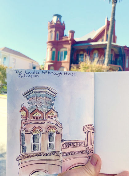
The other house people were drawn to was the historic Landes-McDonough house. It would be a challenge for any sketcher.  |
| Chris |
I decided to focus on one part of the house. I love the turret. Watercolor and ink were my materials. |
| Jenna |
Jenna had a similar take. She picked one section of the building and drew just in ink, but in great detail.
 |
| Judith |
Judith took a much longer view, but kept the details very simple.The palm tree and all the green landscaping complement the red brick. |
| Linda P |
Linda also kept the details very simple. Large blocks of watercolor form all the shapes of the house body. Again the color is simple: green, red and yellow with a little blue sky. |
| Bruce |
Bruce took a similar approach although his palette is slightly different. The steps in shadow are a nice touch. |
| Lisa |
Lisa started in red pen and inked in more details. One nice detail that sets the scene is the overhanging branch at the top. It gives you sense of the viewer's perspective. |
| Carlos |
Carlos worked in marker. The details on the porches and the addition of the purple shadows are excellent.
 |
| Mary R |
Mary Regan started her marker sketch and ran out of time. But the color of the marker is rich. More on this sketch in a future post.
 |
| PM throwdown |
By the time we got to the afternoon throwdown, we were all pretty tired, but satisfied. The day was beautiful, the subjects were challenging and the results made us all pretty happy.
Please think about joining us on future sketch-outs. Join our FB group to get details by answering a couple of security questions. OR follow us on Instagram.